Designing better UX for financial products: how we’ve built online debt collector


When you think about the financial sector, the first words that come to your mind may be ‘numbers’, ‘data’ and ‘graphs’. On the surface, finance belongs to a rational, abstract world. In truth – according to data – 80% of consumer behaviour is determined by our subconscious, so the irrational part of our brain, prone to impulses and rapid changes. That’s why it’s so difficult to predict what actions people will take when it comes to finances, whether it’s when using a banking app or during the financial crisis.
It’s not entirely clear why people act impulsively, but one of the reasons behind it may be the fact that the vast majority don’t understand how finances and the sector work in general. There’s also little education in schools about the topic, which makes the financial industry, combined with the fact that most people don’t find it easy to discuss their finances with others, seem murky and not to be trusted. Research conducted by CreditCards.com in 2017 found that65% of Americans are terrified of checking their bank balances, with most people having trouble sleeping and feeling stressed about their financial issues.
That’s why your first principle when creating a financial product (or any type of digital product) is making sure that it’s both transparent and user-friendly. Misguiding your users, letting them do something unexpected, or forcing them to go through lengthy processes are some of the worst mistakes you can make as a UX designer.
These action in turn build trust which is particularly important for the financial sector. The average customer’s trust level for the banking industry is at only about 40% while for technology companies, it’s currently at about 70%.
This takes us to why and how to design financial applications. The most important element for any financial application will be removing friction for the users, and what’s perhaps even more important, is to make them feel good about themselves.
In today’s post I will be breaking down how at Spyrosoft, we designed the UX for online debt collector with support from our UX Designer, Konrad Hawro who will be sharing his personal advice for building better digital finance products.
For more information about UX and UX audits, read this article >>> UX Audit – why do you need it and what are the key metrics?
Psychological concepts for better UX in financial services
But before, we’ll dive in, let’s go through another aspect you should keep in mind when designing for financial services: the psychology of users. Although we can base our research on data and trends, this isan area not to be missed. After all, users are real people with emotions, impulsesand environments that influence them on an hourly basis. Financial security and finances are sensitive topics that are rarely discussed in public, so surprising and unexpected user decisions and preferences may occur that you couldn’t have predicted just by looking at numbers and behavioural statistics.
Here are the easily overlooked yet important psychological concepts you should not forget as a financial services UX designer.
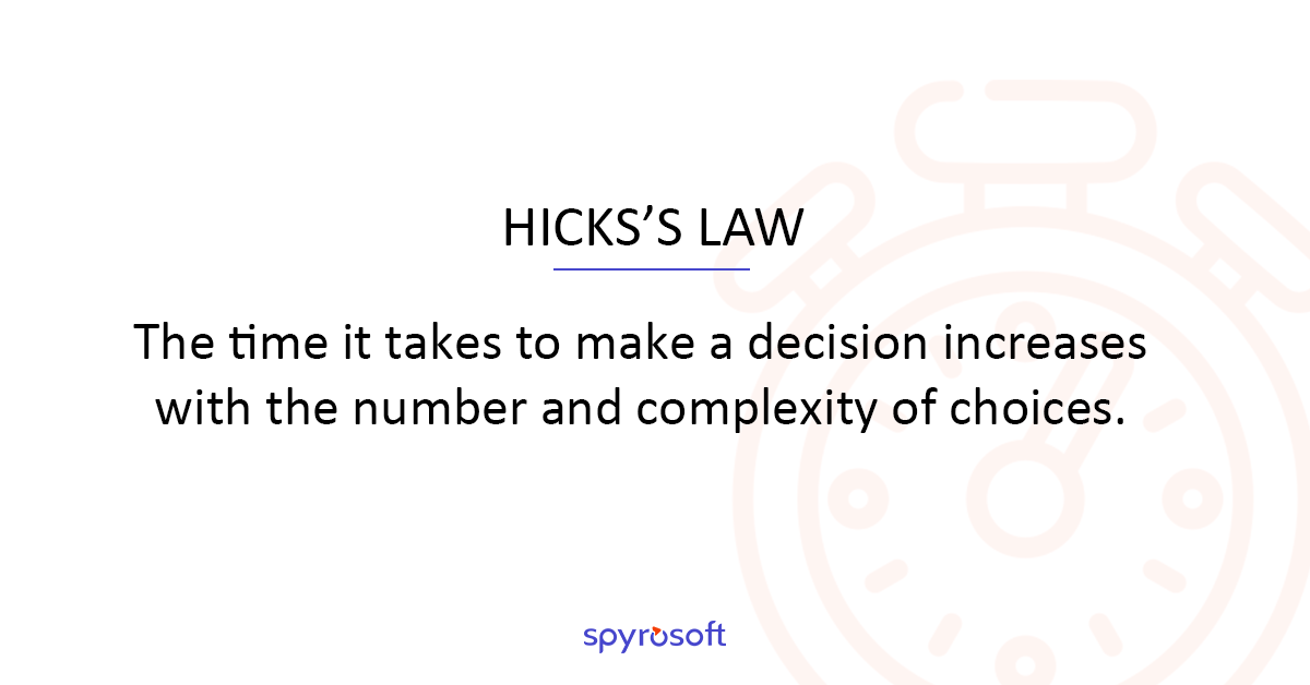
Hick’s Law
The time it takes to make a decision increases with the number and complexity of choices.
The name of this principle comes from the research study conducted by two psychologists, William Edmund Hick and Ray Hyman in 1952. They discovered that users take longer to make a decision on which stimuli to interact with if they’re given many options. What does this mean to you as a designer? Even if you need to include a lengthy process in your design, break it down into smaller steps and highlight the recommended options. This way, you won’t overwhelm the users, and your drop-off rate will be lower.

Miller’s Magical Number
The magical number is seven, plus or minus two.
One of the most cited psychological concepts can also be used when designing financial applications. In his 1956’s study on the limits of human capacity for processing information, cognitive psychologist George A. Miller discovered that participants could ‘store’ ‘seven, plus or minus two’ items in their short(or so-called working)memory. When creating UX flows and User Interface, remember that going over this number of elements may cause users to drop off or not process the given information.
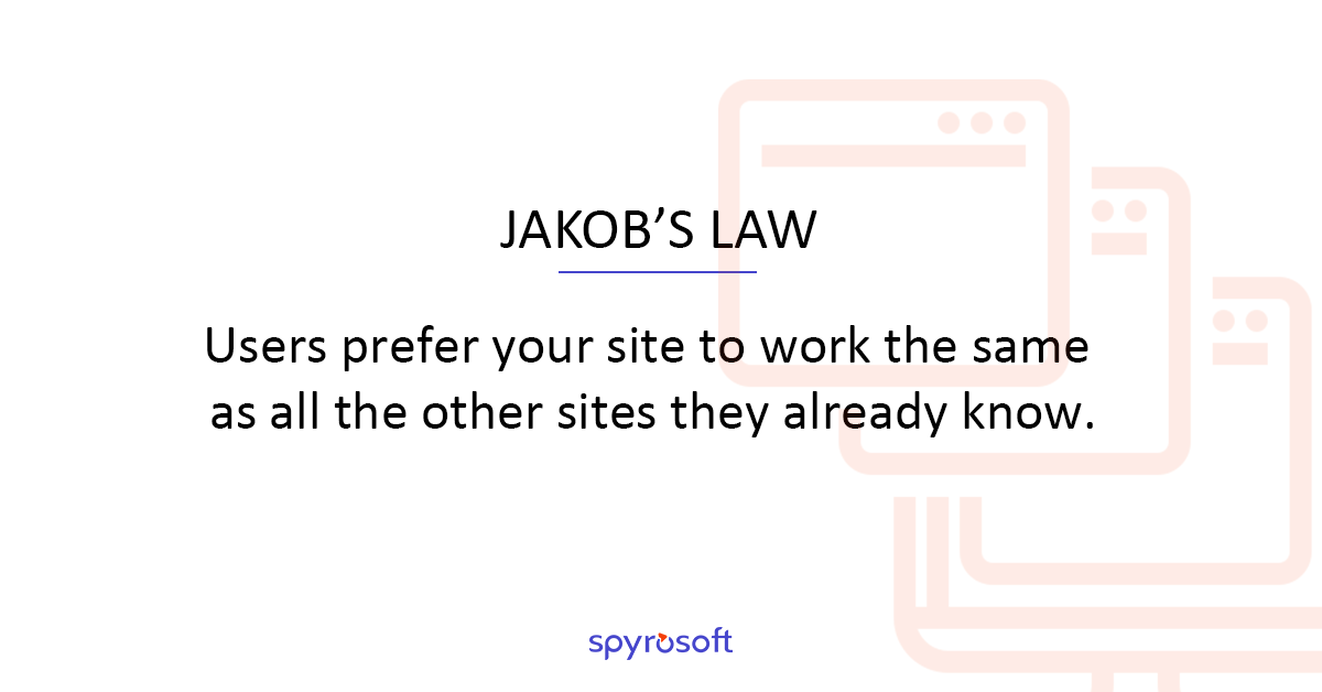
Jakob’s Law
Users prefer your site to work the same as all the other sites they already know.
It’s easier for users to follow the models they already know from other web pages and applications. If they’ve already used one product from a particular category, they will transfer the behaviour expectation to all other solutions of this sort. Avoid forcing them to learn new user flows during the onboarding process and immediately after.
How we approached designing UX for the online debt collector
Looking at the demographics of our client’s customer base, we knew one thing: we wanted to make this platform accessible for younger audiences. According to the survey about ‘Millennials and Wealth Management’ from Deloitte, 57% of millennials would consider changing their financial provider for a better technology platform. Therefore, the final solution had to be equipped with an easy-to-use User Interface where users could complete almost any action, such as applying for any additional funds, manage their loans and sign agreements, with a few clicks.
There was also a physiological aspect we were trying to address: users who wouldn’t be willing to manage their debt via a phone call may be more likely to do it in one place online. They wouldn’t have to share the details of their current situation with customer reps; they can simply log in and choose the best way to handle their payments. The whole system is built in a way that is focused on supporting customers. Wealso wanted to address the mental discomfort that users may have around their finances by limitingthe number of clicks needed for completing actions. That can help them reduce the emotional burden related to having and managing debt.
As a UX Designer, Konrad Hawro describes the requirements that we were given as being based on the actual processes that were conducted by the company internally. They were using paper documents and manually entering information into an internal CRM system, based on phone calls with their customer. Our main task has been translating it into an application and putting it all together in one place.
Before the actual design work started, we were trained on the security issues in the debt management sector. I also had a chance to participate in a meeting with some end-users – the people going through the debt management process. I learnt how they approach the process, and what type of sales methods are applied.
Konrad Hawro once more: ‘We started with UX models defining all the crucial functionalities and the customer verification process. We based the whole creation process for these on the client’s requirements and the user personas. Later on, we also prepared ready-to-be-implemented designs and UI elements that were aligned with the client’s branding.’ The project included three different layouts: for desktop, tablet and mobile. The final stage was auditing the ready-to-use application with the future end-users, real customers.
3 tips for designing better UX for financial products from UX Designer, Konrad Hawro
- Know your user
As is always the case when designing UX, it’s good to know your end-user, their limitations and goals. In this client project, the crucial factor was the mental state of people undergoing the debt collection process. It’s rarely taken into account by designers creating user personas, but it’s essential for better understanding the end-user.
- Build trust
In the financial app, ensuring the security of the users and making them feel safe is crucial. Don’t forget that after all, users will be entering their sensitive and confidential data. One ambiguous message or inconsistency in the design and the trust you’ve so painstakingly built can be eradicated
- The more information, the better
Specific to the financial industry is the fact that the users are more likely to carefully read and analyse, so remember to provide all necessary details and information. This way, they will be reassured. When it comes to managing their finances, users think twice before taking any action.
Wrapping up
We hope you found this summary of designing UX for financial products useful and that you will benefit from the information about our process, as described by Spyrosoft’s UX Designer, Konrad Hawro. Follow us on LinkedIn or Facebook for more articles like this one.


![[hero] why manual trading is costing you more than you think](https://spyro-soft.com/wp-content/uploads/2025/08/hero-why-manual-trading-is-costing-you-more-than-you-think-scaled-1-150x150.jpeg)
arrow_circle_rightcontact us
Transform your financial products with cutting-edge technological innovations. Contact our expert.

arrow_circle_right our blog