User Experience is all about designing for efficiency: an interview with Konrad Hawro

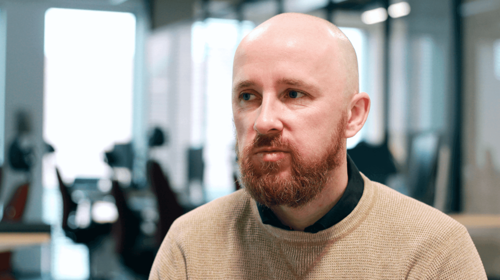
This week, we’re interviewing Konrad Hawro, Product Designer at Unravel about his experience in a project developed for TakTo Finanse and how he got into UX design. It’s a part of our ongoing series on how we work at Spyrosoft.
What does User Experience mean to you?
Good UX not only lets the user achieve what they intended to do, but also makes suggestions and takes them in a direction that was pre-defined by the app’s designer. That’s why, it’s important to decide not only on the product’s features, but also on the business goals that they will be helping to reach. I think that a good user experience solution combines both aspects.
Why and how did you get involved in UX?
I’ve always had a knack for graphic design and my professional path has directed me onto the more technical side. I’ve applied my experience in both areas for UX and designing interfaces.
When I work on designs, I feel that I have a direct impact on how people are using the latest technological solutions. By creating accessible platforms, I can also allow others, who previously didn’t have a chance to do that, to use them.
What’s your take on the difference between the UX and UI?
UX is a project layer that covers the application’s architecture and performance. UI is a visual side that can impact the user’s reaction. We love to use applications that are pleasant to look at. In my opinion, the best UI doesn’t absorb the user too much – the user interface is not a website or leaflet where the goal is to sell. In most cases, it’s a tool to complete an action in the easiest and the most delightful way.
How do you work on projects?
I always start my work with defining the needs and the goals of a customer. If it’s possible, I also meet with the customer’s end user and I conduct an interview with them to understand how they see the world, how they use technology, what they want to use a certain solution for, and what does and what doesn’t matter for them. This stage is preceded with the discussion with our customer and the UX workshops where we work together on the project goals as well as on the product functionalities and implementation roadmap.
The next stages are centred around designing the solution’s architecture and the user flow. When all of that is clear and we have enough building blocks to start building the solution as a whole, only then can we create UX wireframes or in some cases, a detailed interface design. For every project, I also prepare a base of UI elements that can be used for building new functionalities at any point in the future.
The project doesn’t end after designing all screens though – I always support our customers and the developers afterwards when they’re implementing the project. Often, it’s where most of the changes happen – during the implementation and after testing.
How do you work with developers?
I always try to understand the limits related to the chosen technologies so that I don’t put any extra burden on developers. Obviously, this doesn’t mean that we can compromise on the application’s UX or UI.
Together, we are trying to work out solutions that would be intuitive and user-friendly and that would be using the chosen technological frameworks to the maximum.
So, the application would not only look good but also first and foremost, perform efficiently and serve as an easy-to-scale tool in the future.
How did you start designing TakTo Easy chatbot?
I started designing the chatbot by researching existing chatbots, the online loans industry and by identifying the application’s target group. I also tested several debt management systems. Following these activities, I prepared the initial wireframes with basic functionalities. After a few iterations, we had a set of designs ready.
What was most important when working on this project?
By the time when we were ready to launch, there weren’t that many commercial chat bots on the market, so we were pioneering in the fintech sector. When working on the chatbot for TakTo, I knew that it can take time for interfaces of this kind to be seen as natural by their users. It’s especially difficult in Poland – as Polish is a complex language which makes introducing NLP solutions more challenging.
Do you have access to information on how people are using the product prepared for TakTo? Was there anything that surprised you?
After launching the chatbot, we collected data from the group of test users to increase the number of conversions. Thanks to the analytical solutions that we’d implemented, we’ve been able to spot the places where the users got stuck.
We then had to divide the chat into a series of shorter questions and prepare a set of ready-to-use responses that users could pick from. We also added the ability to go back to any point in the conversation.
The system lets us edit the whole process and as a result, the team at TakTo could change the conversation flow following our suggestions. The solution always allows us to improve the process and to adjust it based on the situation and campaign.
arrow_circle_right our blog
