How is the visualisation of geospatial data done?

The development of data science has brought in new ways to leverage data to create valuable insights. However, with big and complex data sets, it’s difficult to draw conclusions by analysing endless tables. Geospatial data visualisation helps tell the story behind the data.
In this article, created in cooperation with Michal Lupa, Principal Software Data Engineer at Spyrosoft, we explain the various techniques of geospatial data visualisation and how it’s done.
Why visualise geospatial data?
There is a growing need to understand how different variables correlate to geographical locations. Without visualising these complex relationships, it’s almost impossible to make meaningful data-driven decisions.
The geospatial data are usually visualised in the form of static or interactive maps. Maps allow context for the data to be created using shapes or colours to reveal patterns and draw focus to specific areas. They help to spot deviations from the norm, problems, and to observe changes and trends. Geospatial data visualisations are also often used to make predictions.

What are the map types?
There are a plethora of map types, which show different types of data in different ways.
Maps can be first divided into reference maps, such as political, physical, or topographical maps, and thematic maps, for example, climatic, economic, agriculture maps, etc. Another division of maps is based on how the geospatial data are visualised. There are multiple types of maps that illustrate data in various ways to make reading complex information easier, for example, heat maps.
What are the techniques of data visualisation?
The techniques of data visualisation depend on whether it’s raster or vector data being used. It determines the tools that are used to visualise data on a map.
Vector data are very detailed graphics that can be zoomed into without losing their sharpness and clarity. In contrast, the level of detail of raster data depends on the resolution. The bigger the resolution, the more detailed the zoomed picture will be. Below you can see the difference between vector and raster data.
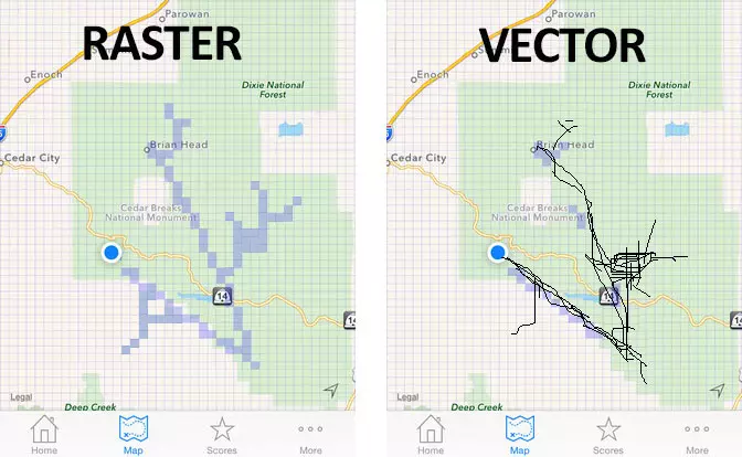
Source: geoawesomeness.com
Object-based models vs field-based models in geospatial data visualisation
The data can be visualised on a map in two ways: as an object-based model and a field-based model.
The object-based model is often identical to the vector data. Each object visualised in this model has defined borders, is distinguishable and categorised. The field-based model represents continuous data. This way of visualising data makes it possible to, for example, show the topography.
How are maps created?
The map creation process starts with raw data, which aren’t symbolised, or in other words – they lack a graphic layout. It’s nothing more than just geometric shapes at this stage.
Next, the data go through a cartographic process, which means they are processed using GIS software. Geometric shapes and points become statues, pharmacies, museums, etc. At this stage the colours are added to properly code the cartographic symbols, for example, brown is usually used for buildings, green for green areas and blue for waterbodies. This choice of colours makes the map intuitive to read.
Maps are made of a set of layers. Each layer represents a separate table in a database and holds information about certain types of objects, for example, buildings, streets, waterbodies or green areas.
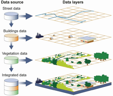
Source: https://docs.geoserver.geo-solutions.it
How are data visualised on a map?
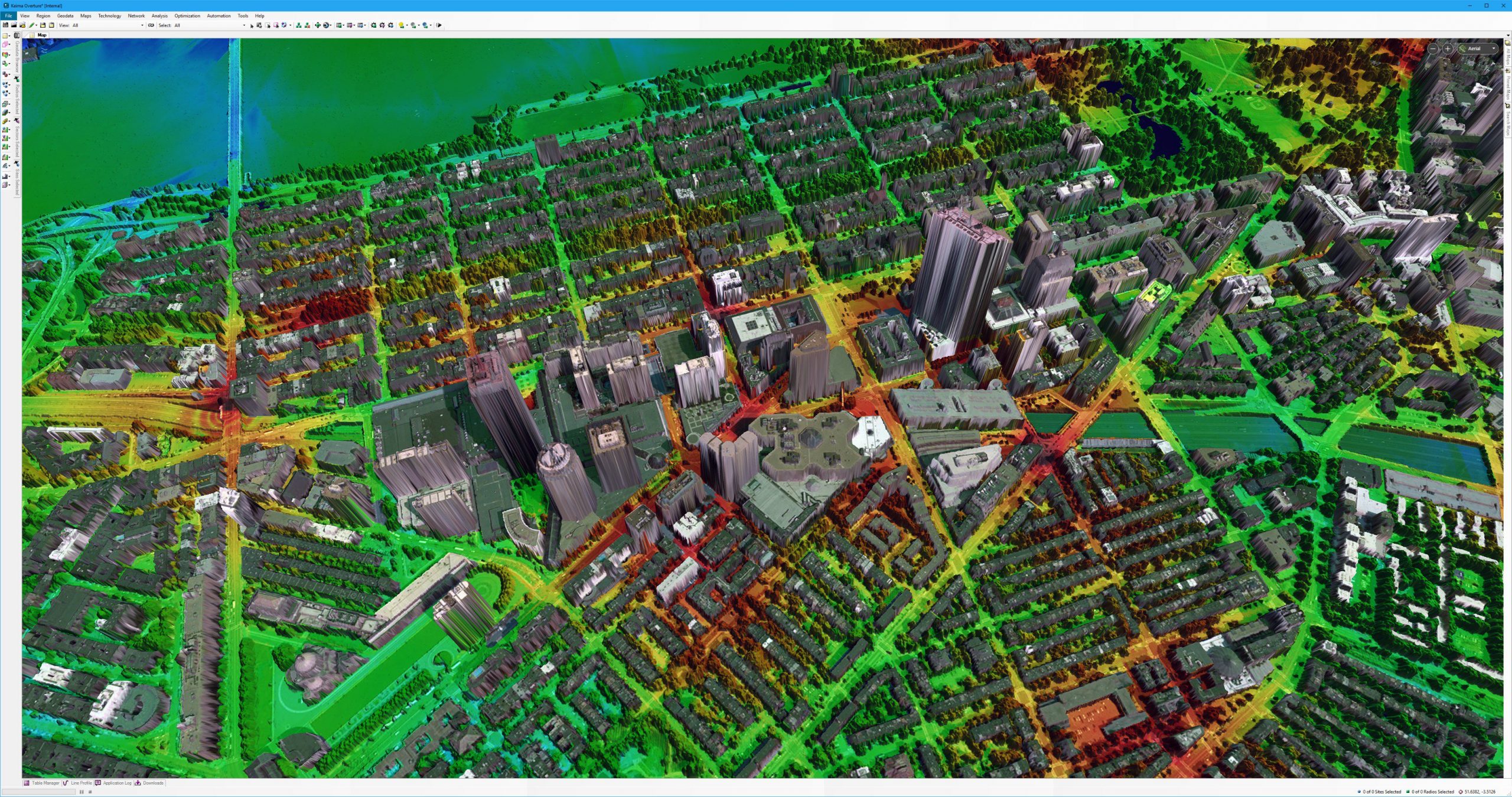
Maps are often a background – they provide a graphic context for data visualisation. In the example below, the graphic context is provided by a satellite image. This base map is then layered with 3D buildings and a heatmap showing the intensiveness of a certain phenomenon. The colours correspond to the level of intensity – usually, red represents a high value and green is used to mark areas with a low value of a certain variable. Presenting data in such a context makes it easy to analyse.
Source: https://twitter.com
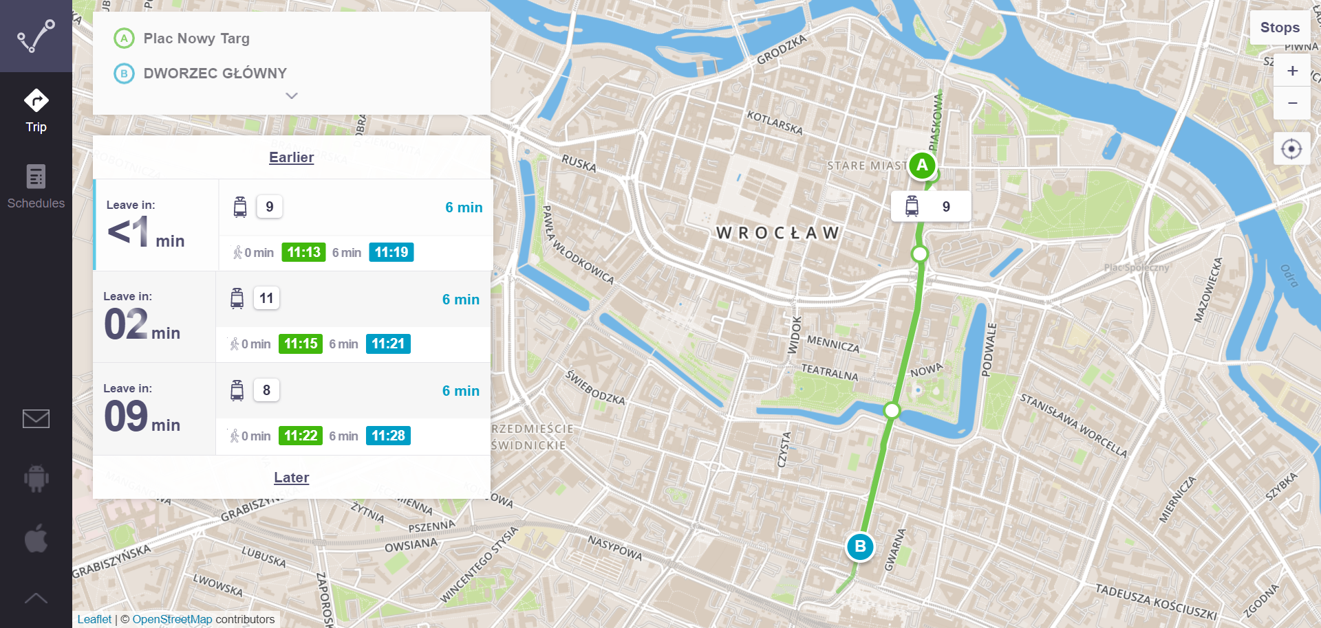
The next example comes from a Polish app called Jakdojade, which allows users to quickly search public transport connections in the biggest Polish cities, check current timetables and buy tickets. The screen shows a tram route layered on a topographic map of Wroclaw. The user can quickly get an idea of what parts of the city the route leads through and where the next stops are.
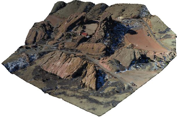
Another way to visualise data are 3D models. For example, a photo taken by a drone can be converted into a point cloud (a set of data points in space, where each point has its set of coordinates).
Source: wikipedia.org
Point clouds are used for many purposes, such as creating digital terrain models or 3D CAD and Building Information Models.
To conclude
There are multiple ways to visualise geospatial data – in this article, we’ve only discussed a fraction of them. The method should be matched to the character of data that you want to represent in a geospatial context. That will allow you to understand complex relationships and draw the right conclusions quickly and easily.
We’ll help you visualise your geospatial data. Visit our offering page and contact our geospatial experts for more information.


arrow_circle_rightContact