How are maps made? The story of data collision with tiled web maps of USA and Canada

Who doesn’t love maps? Bike maps, historical maps, topographic maps, touristic maps – we all have a favourite. It’s hard to imagine a reality without using them on our phones and computers. However, we rarely wonder: how are maps made and displayed so neatly on our screens? What technology drives them, and what is happening behind the scenes?
The way from a file to a tile
It takes a long time before a map becomes a nice, coloured picture displayed on our screen somewhere on the hiking trail when looking for the name of a nearby peak. Initially, maps are usually prepared by specialists following many standards of cartographic presentation – then saved in digital form in various formats. However, the criteria for sharing spatial data via the Internet, be it mobile applications or browsers, are governed by different rules. The format requirements are strictly defined and limited to improve data transfer between the server and the client (for example, you, using some app on your phone).
Sometimes maps are quite big, as these files represent the whole country or another area. Hundreds of square kilometres in a high resolution – you see the challenge. It would be a disaster if your phone had to download it all only for you to be able to zoom into details of a small area. Fortunately, we handle it differently. Currently, such large maps are just the first step – a source of data which feeds the process of transforming a bigger picture into something that supplies modern map services — tiles. And here they are, an essential solution for your map applications.

From macro to micro scale with small and neat tiles
What are web map tiles exactly? Imagine a situation where you want to see a small area on the map: what buildings are marked on it or to check the name of a lovely lake on the horizon. So, you zoom in on the map on your phone, and simultaneously, the server wonders what to show you. If the source data is a large map, a whole sheet describing hundreds of square kilometres in the area, your query will download a large amount of data. As a result, the map is loading and loading, and you slowly lose your patience. But imagine something different – there isn’t one big map, no waiting, no blank screen, no request taking forever to load. Instead, the whole world is systematised transparently using three parameters – z, x, y – where z is the scale in which you want to display the map, and x and y are the appropriate columns and rows. So by zooming in on the lake as mentioned above, you are simply asking: ‘Hey, show me tile 14/9134/5575, thank you very much!’. And the server is sending you just this piece of a map – quickly, neatly, as it should be done.
Tiles web maps’ standards
There are several protocols and standards for creating tiles, but most often, they are 256×256 pixel PNG files – always the same size, no matter how much of the map they show. The larger the scale, the greater the zoom level and the smaller the map fragment fits on one tile. According to the TMS (Tile Map Service) protocol, zoom 0 covers the whole world with just one 256×256 pixel tile. For zoom 1 there would be 4 tiles – 1/1/1, 1/1/2, 1/2/1, 1/2/2 as we will have two columns and two rows. Each zoom level (z) covers the world with the number of tiles corresponding to the rule number of tiles = 4^z. So, for zoom 11, global coverage is provided by 411 = 4 194 304 tiles, for this zoom, each tile represents an area of the average city. So, when the client asks to display a certain area, a query for specific tiles is sent. Even if it is an area of the whole country, it will not be a large, heavy raster, but a few small tiles previously generated on its basis.
Tile management – the difference between working with a regular map and a tiled map
The tiles are great. They ensure order and certainty of what to expect. But the larger the area of interest is, the more tiles we have and the more carefully we have to manage them. Especially when the tiles are counted in hundreds of millions, taking up terabytes of memory, and all operations to carry out on them must be carefully considered.
For example, we have a topographic map of the USA already cut into tiles for 7 zoom levels. The original map overlapped the border of another country – Mexico. We decided that we wanted to clip the data so that it exactly fits the boundary of USA. It seems like a simple spatial operation:
input data -> clipping operation -> save output
It would work like a charm if we had some referenced GeoTIFF and a mask. But with a mask and millions of unreferenced small tiles, things get a bit more complicated. Usually, tiles are not georeferenced – instead, a specific name defines the location of a given tile. Each zoom is a separate folder, each column is a subfolder, and the tiles are stored in them with the name of the corresponding row. It goes like z/x/y.png – the lake we mentioned before was 14/9134/5575.png.
Not every software can read tiles directly from such a structure. Most require georeferenced tiles first, based on an appropriate formula that calculates the location of the corners of an individual tile. Only here can we start cutting, although does it make sense to process millions of tiles that are far from the Mexican border? Not really.
US – Canada border: in search of the optimal solution
Manipulating one set of tiles, if there are many, may be difficult but still a bit simpler than putting together data for two countries. Provided by various sources with slightly different specificities.
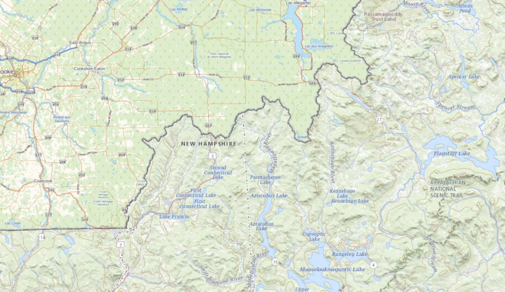
This year we faced the challenge of joining two datasets: from the USA and Canada. Two huge countries for which we didn’t simply have two maps to merge, but hundreds of millions of 256×256 tiles taking up several terabytes of memory.
Both datasets have their characteristics, neither of which was limited to its territory. The tiles in the US dataset also extended deep into Canada, and the tiles from the Canadian dataset extended into the territory of the USA. There was also no rule that the entire territory of a country was covered with data. Sometimes there was a gap in the US territory that was covered by Canadian data, and sometimes a gap was just a gap – without any data in this region. There were gaps, overlaps and many surprises.
However, the simple task was to combine the land and sea border data as smoothly as possible and create one common dataset.
The first approach and the first failure
The first problem to tackle was overlaps. With such a large amount of data, it was critical to find all areas that had coverage of both datasets and then prepare a process of merging it so as not to overwrite yet keep the original sources.
After the first thought, we divided both datasets into two parts: tiles that are unique for a given set and those that are duplicated. The data was processed by a Python script that checked file by file, every z/x/y.png from one dataset – if in the location with tiles for the second country also, the same file z/x/y.png appears. If yes – both were moved to appropriate folders – USA duplicates and Canada duplicates. Unique files in the folders of the country were moved to the designated folders.
By doing so, we had complete clarity about which files were unique, and which were duplicated and it only needed to be decided what to do with them.
With the FME software, a process for duplicated files was prepared, which loaded both tile sources, along with polygon describing USA border prepared by us, used for data clipping. In this way, the data was read and processed according to the following logic:
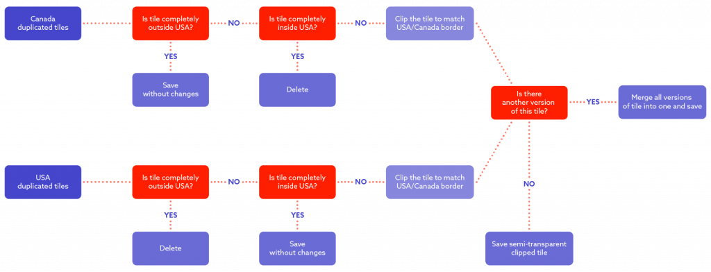
Regarding the diagram above:
For Canadian tiles: check if tile is completely outside of USA – if yes, just save it as it is, it is probably just a tile representing Canada – if it is not outside, there’s another check – maybe the tile is completely inside the USA? If that’s the case, the tile will be dropped and not processed anymore – at it is a tile from a Canadian dataset but showing the USA, but we do have a USA dataset for this area (as we are processing duplicated data) so there is no need for us to keep it. If it is neither totally inside or outside it is a border tile – so it needs to be clipped to the boundary of country. Let’s stop here for a second and take a look into the USA dataset – we apply same logic, but reverse actions, if the tile is completely inside the USA – it stays, if it’s outside – it is dropped. If it is a boundary tile it is clipped. But if it is a border tile there’s a chance we will end up with two versions of same tile – one with data from the USA side and one with data from the Canada side (for example 14/4115/5695 tile). In this case the tiles needs to be merged into one final tile.
In the end we had the following:
– merged border tiles,
– unmerged clipped border tiles
– from the remaining duplicates – only one version was selected
– unique tiles for the USA,
– unique tiles for Canada.
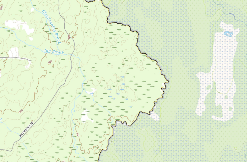
At first glance it looked great, and perhaps such a flowchart is useful in some cases. Primarily we intended to limit the amount of data entering the process, looking for doubled tiles to be clipped and merged. However, the longer we analysed the results, the more visible flaws the of our plan were. First of all, it transpired that in some places (e.g., The Great Lakes), there are gaps in datasets supplemented with other datasets – e.g. the part of the lake on the USA side did not have data from the USA dataset but had data from the Canadian dataset. So, they were unique tiles that went through the process unchanged. At first, we thought it was good – any tiles are better than none. However, in the long run, it caused chaos in the data. The colours describing the water differed slightly between the two datasets, resulting in different shades of blue mixed together which looked quite messy.
The situation mainly concerned The Great Lakes and the larger bays on the east and west coast – and the USA dataset only had gaps automatically filled in by the Canadian dataset. We still wanted to save this solution and decided that areas where previously “unique” Canadian data must be clipped so as not to enter US territory – but to limit the amount of processing still, critical areas have been manually selected. Unfortunately, as you can guess, it was a tedious job, and thus – there was a lot of room for mistakes and shortcomings. Later it turned out that it might solve the problem to an extent, but unfortunately, we also started to see single USA tiles appearing randomly in Canada due to gaps in the Canadian dataset, and vice versa, and we wanted the data to be consistent. Due to a large number of errors and the impossibility of automating the process, we decided to give up here, learn our lessons and look for a new solution.
Give me the list and I will give you the data
We looked at it from a different angle – not the data we have, but the tiles we want. So, to prepare for the zoom levels we use a list of all the possible tiles that describe that area of the USA and Canada. And it was simply a game-changer. Then we prepared polygons, one for the USA and one for Canada, each describing the border between countries and the areas from which the data is of interest to us within a given dataset. And here there was no guesswork – based on these three things – the list of all possible tiles in this area, the polygon with the USA border and the polygon with the Canadian border.
We created three lists:
– a list of US tiles,
– a list of Canadian tiles,
– a list of tiles to be merged or clipped because they intersect with some border.
And… done! Okay, almost done. But, it proved to be a straightforward way of creating automatic processes in FME software. A list of USA tiles + USA dataset = only tiles inside the USA selected – no matter if they have a duplicate somewhere or not, there is no room for mistakes. If a tile is on the list for merging – it will be processed. It is the same for Canada. Even if a tile is unique, but it is on the USA side of the lake, it will be dropped.
Everyone needs something different – so does data
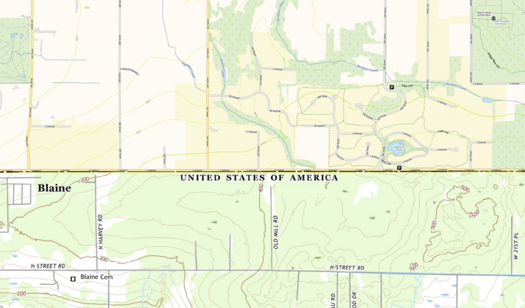
The process of merging and clipping performed in FME may sound not very complicated, but it must be investigated and adjusted to the input data. Regardless of the country, each subsequent possible tile is checked to see if it exists in our datasets, and if so, loaded to FME, it requires geo-referencing to be clipped to the appropriate polygon. Further, the process may be slightly different for different datasets, but we need to set the proper palette and number of bands and assign the appropriate value to NODATA. For some datasets, you should also filter 100% empty tiles. Finally, we are looking for tiles that appear in more than one version – they will go to the RasterMosaicker, where they will be assembled into one final tile. If there is only one version of this tile, it will be just saved as a clipped, semi-transparent tile. This way, the border tiles will be neat and coherent. For example, in one go, we also tidied up the tiles from the border with Mexico – they were neatly clipped to the border.
How are maps made? – Create, test, improve, repeat
Such data processing was much simpler for us in terms of the repeatability of the process and corrections after tests and discussions. In the case of a decision to change the clipping border polygon, it was enough to run subsequent processes – load a new polygon, create tile lists, organise/move files, and merge. That’s all.
Of course, for higher zoom levels and smaller scales (e.g. zoom level 16) the number of border tiles was still as high as several million of tiles – the weak link here is the RasterMosaicker tool in FME,
which in such cases slows down significantly, due to the need to store all elements in its memory. The solution was to split the list of tiles that needed to be processed with a merging/clipping process into smaller chunks and queue the operations through the FME Server. In this way, our work was even faster and more optimal.
Benefits? A lot. Disadvantages? We haven’t found them yet
The best part is that the logic we have developed for the USA and Canada is reproducible for other countries and more than two countries at a time – there can be any number of them. There is no problem with updating the data – the data from the update passes through the processes. Any dataset based on tiles is now much easier for us to manage, control and update. Everything is clear and transparent – as it should be.
Want to learn more about geospatial solutions? Click here.
About the author
Katarzyna Adamek
Data Software Engineer
Contact us