User experience in ecommerce: a UX audit of Zara’s and Nike’s online stores


Nowadays, UX (user experience), plays a crucial role in designing and creating ecommerce solutions. Online stores want to achieve the highest possible traffic and conversion rates, which translates directly to high profits. To achieve that, you need to ensure that your website is as intuitive and comfortable as possible.
This approach will make the purchasing process more efficient and pleasing for customers. However, to get there, you need a well-prepared UX and UI layer of the store, which will also improve conversion and strengthen the positive user experience. To be sure that the solutions implemented on the store’s website are well-designed and convenient for users, it is worth conducting a UX audit, at least occasionally.
Below, we explore the advantages of such an analysis and present the results arising from the audits of two exemplary online stores.
UX principles for ecommerce in relation to user behaviour
Research clearly states that customers give up shopping and leave ecommerce websites that give them a negative impression – for example when they “get lost” or have to think too long about where they should click to search or buy a given product. Sometimes, the information presented on the main page or in the category tree can confuse users. This means that they can jump to the wrong conclusions and leave the site with the conviction that there’s nothing there for them. There is quite a lot of research on this subject, so you can rely on already-proven knowledge. This makes it easier to conduct an effective UX audit of your own store and streamlines the process of designing a new layout that meets your customers’ needs.
A perfect home page should contain key information such as the offer of a given store, a visual representation of the main categories, as well as photographs showing the available products in a broader context. All the places with inspirations, product categories, and additional tools for finding gifts or choosing sizes placed on the home page also work very well when it comes to guiding customers through the subsequent steps of the purchasing process.
Elements such as carousels with banners also need to be designed with users in mind – they cannot slide too fast and should stop when the user hovers the cursor over the selected slide. On the other hand, showing pop-ups or other similar intrusive advertising banners won’t help to win customers, so you should always be careful with assets like that.
The business success also depends heavily on the taxonomy and construction of the category tree on the website. Navigation must be intuitive; it should leave no doubt as to where the user can find the products they need. Granted, achieving this is not always easy, especially in the case of stores offering a wide range of different products. However, devoting more time to creating a good category plan before implementing it can be extremely profitable. After all, a customers’ willingness to browse the store’s product catalogue is on the line.
To introduce the most important issues for consideration during a UX audit, we have conducted an analysis of the main pages and product categories of two popular brands: Zara and Nike. The whole piece was prepared with the help of user experience research tools created by Baymard Institute.
UX audit: ZARA
Home page and layout
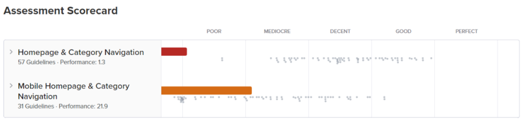
✓ The current homepage of Zara is built entirely on carousels (both vertical and horizontal). The latter serves as a visual representation for almost the entire offer (as much as 85% of the most important categories from the main menu). This is a very good result because many users visiting the online store for the first time evaluate the offer based on the home page. Therefore, its diversity should be showcased visually, by clearly showing the main product categories.
❌ However, if we look closely at the implementation of vertical sliders, things get a bit worse. Slides that are not videos scroll automatically every 4 seconds. In the desktop version, they do not stop when hovering over them with the cursor. What’s more, the navigation from the slider disappears and appears only when the customer is using the mouse scroll. Only clicking on the slider control (provided you manage to do it before it disappears) stops the slideshow. The carousel controls also disappear on the mobile version of Zara’s website. And even when they are visible, it’s difficult to find them, thus clicking often redirects the user to the page to which the current slide is linked. According to UX research, carousels should not dominate the store’s home page (static content should play the main role). The carousels used on the page should have easily accessible controls, and they should stop when you hover the cursor over them.
✓ On the plus side, there are no banners and pop-ups that can be perceived negatively by most users.
✓ The products on the homepage are showcased in specific contexts, so it’s easier for the user to imagine the clothes and other items offered by Zara being used.
✓ The logo is placed in the header, and it leads the user to the home page – this is a very good UX practice.
✓ Another positive is that Zara does not require the user to log in to browse the product catalogue. What’s more, both the footer and the header contain links to all the relevant information, which is visually distinguished and grouped semantically. There are no chat boxes and pop-ups jumping out on the page, and it’s hard to find specific UI missteps.
❌ Zara uses geolocation to determine users’ location and does not allow them to change it themselves. According to the research, this is not a good practice because the client should be able to make changes as needed. It is also important to place the location switch in the header of the page so that it is always easily accessible to the user.
❌ Texts added to photos are often illegible (for example, a blue menu in a blue photo), which makes it difficult to read.
❌ The Page load performance analysis resulted in an average score:
Largest Contentful Paint (LCP) = 3.8 seconds
All in all, Zara’s main page and layout are not too bad, but there is certainly some room for improvement. The website is rather transparent, so just by viewing it, users can quickly assess whether they will find something suitable.
Subpages and product categorisation
When it comes to the category tree in Zara’s online store, the overall rating is not very good.
❌ To begin with, products with specific types should have assigned attributes that can be filtered instead of creating separate subcategories. On Zara’s website, it’s exactly the opposite. This is not a good practice – it artificially narrows down the search field so that the user loses the opportunity to look at similar products that could be interesting to them. This also results in another malpractice on the company’s website, namely, the main categories have too many subcategories (over 14 in this case). A better idea would be to break down the main categories into smaller, easy-to-read sections. This concept, in turn, leads to another, also an unfavourable solution – Zara’s menu lacks a visual division into subcategories. Looking at the brand offer, the store should decide to implement a third level of product categories (instead of only two existing ones). Importantly, this level exists but is not visible in the main menu of the store. Only after switching to a given subcategory can users discover that Zara’s offer includes, for example, high-rise jeans, medium-rise jeans, skinny jeans, or straight jeans.
❌ Another good UX practice is to showcase the menu items graphically, after which the next level of subcategories should go. The page in the ‘Kids’ category has a three-level division of categories. However, no visual indicator suggests that clicking on individual subcategories will give more options. This solution is also not consistent with other categories on the website.
❌ The main categories in the menu should be clickable. Clicking such a link should take the user to a page with visually showcased subcategories. Another idea is to display a product list with all the items in that category. The latter option is reasonable when the main categories in the menu do not have the subcategory named ‘all products’. On Zara’s website, the categories in the menu open the list with all the products and then with the subcategories that are possible to view only with the next menu. However, it’s not obvious that this option exists because there is no information about it in the main menu.
❌ Zara uses industry jargon in its menu, which can be difficult for many users to understand. As an example, see the ‘Zara origins’ or ‘Zara SRPLS’ categories, which sound mysterious, especially to people unfamiliar with the brand’s offer.
❌ In the category tree, you can find many options that are based on product subtypes. For example, there’s a division of categories into jackets, down and insulated jackets, and shirt jackets. However, it is recommended that product subtypes with specific attributes be implemented as product filters and not as separate subcategories. Moreover, a link to such a category should be shown in the menu, and then a page with all the products within a given category should be displayed, along with attributes. When this is used, users can see a wider range of goods and use the filters that interest them to narrow down the search area. Otherwise, they may miss something they are looking for and lose the opportunity to discover more potentially interesting products. The same rule should apply to the ‘New’ or ‘Sale’ attributes.
❌ It is also a good practice to create so-called intermediate pages where the parent category displays only graphical representations of the subcategories it contains. This is missing from Zara’s website.
Zara UX audit: summary
Zara is not an example of a well-designed website. When browsing it, you can easily get lost. The site is very modern and fancy, but it lacks usability. The category tree is built incorrectly and inconsistently, missing a lot of information that can be discovered only on the pages of individual categories. It’s easy to get lost on the site, and it’s hard to find what you’re looking for. In addition, the brand does not use solutions that lead the customer by hand like guides, or thematic articles, and the category page is not very intuitive.
UX audit: NIKE
Readability of the home page
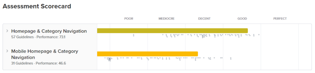
✓ Nike’s website is mostly built of static content. This is a very good practice because it makes browsing the website much easier. There are also product carousels, but they do not dominate the content on the page. Slides are not automatically scrolled, which makes them much easier to view. In the desktop version, carousel controls are easily visible.
❌ Unfortunately, this is not something we experience in the mobile version. Although the carousel can be manipulated by swiping left or right, the navigation controls should still be clearly visible and accessible.
✓ As many as 80% of the main categories are visually represented on the home page. This way, it’s easier for the user to determine whether they will find the products they’re after on the website.
❌ There are links suggesting moving to specific categories, and they are leading to categories with a predefined, narrowed promotional filter. For the average user, this can be confusing, and for some, it can make it impossible to find the items they are looking for.
✓ The lack of intrusive banners and pop-ups makes viewing the website much more pleasant.
✓ The Nike home page is rich in photos, but the products are mostly showcased out of context and shown against a uniform (although expressive) background. The research shows that it is better to show products in a relevant context. This approach communicates the functionality and suitability of the products.
✓ Users can browse the website without the need to create an account.
❌ Nike uses geolocation to determine their users’ location, but not in a clear and obvious way. To change the location, the user needs to scroll down to the bottom of the page and find the location pin in the footer (it’s easy to overlook it). In situations where the user enters the website, e.g., from Germany, using the Polish language version of the browser – the website displays a pop-up asking to select a language. As research shows – such pop-ups can be discouraging because it is easy to confuse the user when those are used for ads and newsletter subscriptions. UX research shows that when automatic geolocation is not possible, it is best to display a full page that forces you to select the appropriate location. In addition, the location change function should be placed in the upper right-hand corner of the page.
✓ The header is intuitive and legible, and the main menu is in the middle. Moreover, the product search engine that offers hints to help users find the right products, is transparent and quick. Also, the logo is clickable and directs users back to the home page – which is a good UX practice.
❌ Moving to a given category page is not visually marked in the menu, which means that the user may feel lost. In addition, the displayed link is active, which is not a good practice from the UX standpoint. When it comes to the page the user is currently on, the link to it should not be clickable.
✓ Both the footer and the header contain the relevant links that are visually highlighted and grouped semantically. There are also no pop-up chat boxes or requests for feedback on the website.
❌ There are a few minor UI errors in the Nike online store (the layout doesn’t look good in some places), and the page load performance analysis resulted in a poor result:
Largest Contentful Paint (LCP) = 5 seconds
Product category tree
✓ Categories and subcategories are visually separated so that the relationships between them are apparent. They are also divided into smaller, more readable groups, within which there are subgroups (e.g., Men -> Shoes). Also, the store doesn’t have a very detailed product division, so you won’t find subcategories that contain less than 10 products. The Nike site also doesn’t have redundant or overlapping categories.
✓ In each parent category, you can find a link to view all products in that category.
✓ Product subtypes are implemented as filters. Thanks to this solution, the user can see a broad range of products, and can then use these filters to narrow down the search results.
✓ The website also has a ‘Discounts’ subcategory. This link takes the user to the section with all the products of a given category with the filter already selected.
❌ However, the solution I mentioned above does not apply to the ‘New products’ filter – this category is separate from all others and contains products from every group.
✓ Other non-product links in the navigation differ visually from the rest and are clearly separated from the product part.
❌ There are several brand-specific names in the store’s menu. For example, product categories such as ‘Nike by you’ or ‘Jordan’ may be confusing to some users.
❌ Nike is inconsistent with category names in their menus, product listing pages, and a few other places. For example, the subcategory “Football” that’s placed in the “Shoes” category on the product listing page changes suddenly to “Men’s football boots and shoes”.
Nike UX audit: summary
In general, Nike’s website is quite good and can serve as an example of a well-designed online store. Navigation is intuitive, and the website is clear and thorough. The category tree is structured correctly and consistently, apart from a few minor issues that could definitely be improved. However, they are not so serious as to underestimate the overall result of the UX analysis.
The examples presented above show how important it is for an online store to follow the guidelines and good UX practices. If you are interested in implementing UX-oriented ecommerce tools and solutions that will support your customers’ purchasing decisions and help you stand out from the competition, check our offer.
A UX audit is a structured evaluation of a website’s usability, identifying friction points that prevent users from completing their intended actions. In ecommerce, poor UX directly affects conversion rates and revenue. An audit provides a systematic basis for improvement decisions rather than relying on intuition.
Zara’s main issues included auto-scrolling carousels without a hover-stop function, a category structure with 14+ subcategories that creates navigation friction, confusing industry terminology that may not match how customers think about products, poor text-image contrast, and slow load time (Largest Contentful Paint of 3.8 seconds). Visual appeal was strong, but it came at the expense of usability.
Nike demonstrated stronger UX overall, with a cleaner navigation structure, non-auto-scrolling carousels with visible controls, proper filter implementation, and clearer category hierarchies. Its weaknesses included hidden mobile carousel controls, a geolocation selector placed in the footer rather than the header, and slow performance with an LCP of 5 seconds.
The most common issues are overly complex category taxonomies, auto-scrolling content that removes user control, brand-specific terminology that does not match how customers search, inconsistent category naming across pages, and performance issues that increase bounce rates. Each of these reduces the likelihood that a visitor finds what they came for.
Largest Contentful Paint (LCP), which measures when the main content of a page becomes visible, should be under 2.5 seconds for a good user experience. Both Zara (3.8 seconds) and Nike (5 seconds) fell below this threshold. Slow load times increase abandonment, particularly on mobile, where users have less tolerance for waiting.


arrow_circle_rightContact us
Need help designing ecommerce products? Contact our expert

arrow_circle_right Our articles